


Data showing Alarming situation of Global Sea Ice
A PhD Student Zack Labe from University of California at Irvine Tweeted an image of a graph on 16th November 2016 supposedly showing a daily time series of the intensity of global sea ice of Earth for every year since 1978-79 when the data was initially made available. The posted graph received a number of retweets and shares since its first publication approximately in the month of October 2016. The graph pointed out that the area of global sea ice is showing noticeably alarming condition and it has never been as low as in the current year. Since generation of this chart, a number of questions raised regarding its authenticity. A user Winepus raised a question and documented the source of data & methods for its analysis.
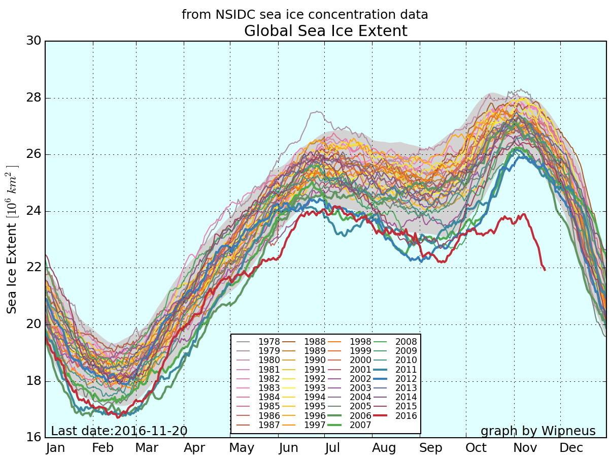
Point to be noted that numbers come from set received from National Snow & Ice Data Centers. The chart was generated on daily basis observations collected from two satellites. From Numbus-7 of NASA and other from Defense Meteorological Satellite Program of the Defense Department. The image was not originally created by any official governmental organization, but publically available date is correct. The CNN reported that Experts from Goddard Space Flight Center of NASA have also recorded similar trends. The overall trend of combined plot shows the cumulative participation of the sea ice in both the arctic and the Antarctic. The Arctic normally reaches at its highest level in winter in Northern Hemisphere and the Antarctic normally reaches at its highest level in summer in the Northern Hemisphere.